Identifying trends in branding designs

Whilst considering all different modern branding designs I found many of the same trends. I found that mainly modern logos have simple typography with some sort of memorable design above it. As you can see from the examples below:

5 4 3 2 1


I think the reason why most companies have latched onto this visual of displaying their logos is because people like simple designs, and also pictures tend to be more memorable than lots of words crammed together. This can be more confusing than intriguing.

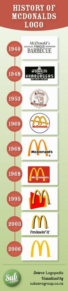
Throughout the development of branding you can see in older logos that they are more complex and have more pictures and writing included. For example, Mcdonalds logo started off quite complicated and eventually became just a symbol. This is because as a company becomes a worldwide company it is easier to extinguish symbols rather than writing as languages differ.

6

Good or Bad? Logos defined.

During the workshop today we were asked to think about logos and how they actually effect a business. A good logo can really determine whether the business sustains sufficient workload and whether it represents the business appropriately. I feel that a good logo is a logo which is simple but also memorable for the target audience. For example, the Apple logo, people know this logo even if they have never owned an Apple product.

apple logo

Furthermore, I also looked into bad logos and how they can really effect a businesses reputation. The logo is normally the image that the audience has of your company and normally the first impression. The example I have found (see below) of Mama’s Baking just isn’t suitable. It is suggestive in the wrong ways and could easily be misinterpreted.

bad logo