Identifying trends in branding designs
Whilst considering all different modern branding designs I found many of the same trends. I found that mainly modern logos have simple typography with some sort of memorable design above it. As you can see from the examples below:


I think the reason why most companies have latched onto this visual of displaying their logos is because people like simple designs, and also pictures tend to be more memorable than lots of words crammed together. This can be more confusing than intriguing.
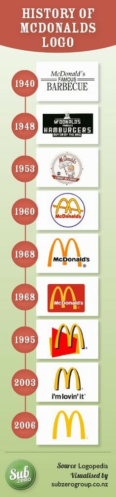
Throughout the development of branding you can see in older logos that they are more complex and have more pictures and writing included. For example, Mcdonalds logo started off quite complicated and eventually became just a symbol. This is because as a company becomes a worldwide company it is easier to extinguish symbols rather than writing as languages differ.
Good or Bad? Logos defined.
During the workshop today we were asked to think about logos and how they actually effect a business. A good logo can really determine whether the business sustains sufficient workload and whether it represents the business appropriately. I feel that a good logo is a logo which is simple but also memorable for the target audience. For example, the Apple logo, people know this logo even if they have never owned an Apple product.
![]()
Furthermore, I also looked into bad logos and how they can really effect a businesses reputation. The logo is normally the image that the audience has of your company and normally the first impression. The example I have found (see below) of Mama’s Baking just isn’t suitable. It is suggestive in the wrong ways and could easily be misinterpreted.
![]()
Food for thought
After more than half the way through the ‘skill cycle’ I feel I am starting to get some ideas for how my final piece could look. At the start when this brief was first announced I was a little apprehensive, however as the workshops have gone on I feel I have gained inspiration from the work I have been taught. I feel I could use a lot of the skills I have been taught in my final piece, and although I feel I may not represent an artist as of yet I certainly have a few ideas. I was thinking of doing my final piece on actually finding who I am as an artist, incorporating the skills I have already learnt and more to come as the weeks go on. The actually basis of my final piece will be basic but incorporating who I am along the way, adding in after affects and I also wish to experiment with augmented reality and projection mapping. However I do have reservations about projection mapping as I would want to project onto a building and getting the permission to do so may be hard.
3D Tracking
This week was my second and final workshop with Jon where we covered 3D tracking and what lengths this type of tracking can go to. In class we explored tracking objects that came into the ‘X’ axis and how we could still track objects even if they went off screen. Providing there was enough data for the rest of the shot. We then went on to create a sinkhole within a middle of the road, which I found really interesting. We were taught how to make the sinkhole look realistic by adding different masks and so forth. Below are both my rendered pieces of work from this week’s workshop: