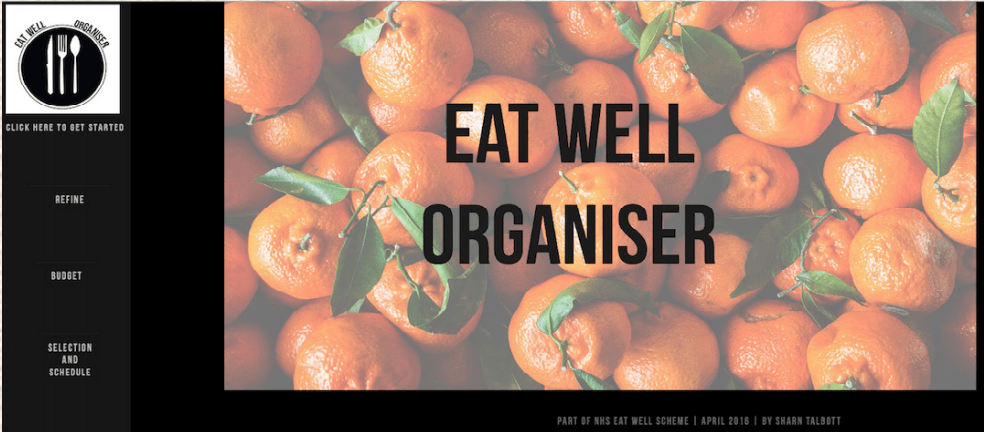
The website I have created for this project discovers the relationship between food and the rising obesity levels in younger children. My website is designed to help guide parents budget and buy fresh quality food, and my website provides them with all of the services to do so. The artist Vycheslav Dronov, who is a Russian web designer, heavily influences the project. After researching him throughout my research and development task earlier this year, I felt his work was something that inspired me to make my website similar. I loved the way his web designs were simple but striking, something that I felt would benefit my target audience. The straightforwardness of the website was something which I really worked on, as I did not want to overload the website with unneeded information. The use of colours in his work is always complimentary and this is the reason I chose the pictures I have on my website. The pictures used for my website are from a free licensed website of food pictures known as: https://foodiesfeed.com/free-food-images/fruit-vegetables. I specifically picked these pictures as I felt they were appropriate for the style and nature of my website. Originally the pictures that I downloaded were very bright and eye catching, however when importing these onto my webpage they seemed too vivid, consequently the text did not appear that clear. I decided to change the offset using Adobe Photoshop to make them appear less vibrant in order to make the text stand out.
Working on the idea of minimalism for my website, I decided to stick with a simple title to. The website is named ‘Eat Well Organiser’ which links to the current obesity NHS scheme ‘Eat Well’. Developing on my idea I decided to make my website an extension of this scheme after feedback was given for my proposal. Therefore this only made sense to keep the title the same, as this title already has awareness and many people already distinguish and understand what this scheme stands for. Furthermore when creating my logo I wanted it to be recognisable to the audience, and as stated before this project was an extension to the NHS scheme. The ‘Eat Well’ program already has a logo, which represents a well-balanced plate of food. So as this website is an addition of this scheme I wanted to keep with a corresponding logo idea, nevertheless still make it my own. This is how I originally came up with the concept of my logo. Earlier this semester when researching for this project I had decided upon two fonts that I would use on my website, these were Bebas Neue and Kelper Std Semicondensed Display. These were both sourced from Adobe Type kit. Nevertheless when creating my website I felt the font ‘Kelper Std Semicondensed Display’ was not suitable as it appeared unclear to read. I chose to change this font to ‘Avenir’ to ensure that the audience could read the information.
The style and aesthetics also changed when I created my website. Originally my idea was to use a block effect and have the information in squares. Although when constructing my website this seemed messy and untidy, this is the motive for changing the style of my website to a more basic style. To create my website I used the software Adobe Muse; this was completely new technology to me, and at first was difficult to use. However with the help from Adobe tutorials online I was able to create this website to the best of my ability. Admittedly I feel there are some areas which could be improved upon, for example the positioning of the website. This was one of the areas I struggled with, for example when anchoring the pages to the menu down the left hand side of the web page, this appeared to scope to the right. Unfortunately I found this difficult to fix. Also the logo on the top left hand side of the web page is only viewable at a certain ratio on the web page; this was something that I began to get irritated with as I tried every tutorial to fix this. Although I have recognised that there are some faults with my website, I still feel I have created a visually appealing website that is suitable for my target audience. I have made critical decisions throughout the process and certainly changed various aspects of my website to better this service for my audience. With extra time and tutorial sessions I feel I could extend this project further and make it fully functioning. To access my website follow the URL: http://nhseatwellorganiser.businesscatalyst.com/